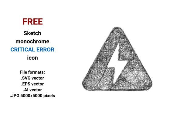
FREE Sketch Critical Error Icon
Need a clear, expressive, and instantly recognizable way to signal something has gone seriously wrong in your interface or design? The FREE Sketch Critical Error Icon delivers just that — with artistic honesty and functional precision. It’s not a sterile red exclamation mark or a generic warning triangle. Instead, it’s a hand-drawn, monochrome pictogram that communicates urgency, failure, or a fatal error while keeping things human, approachable, and visually cohesive.
What Makes This Icon Different — and Useful?
This isn’t just another “error” icon. It’s a sketched critical error icon — drawn with the loose, confident lines of a pencil sketch. That means it fits naturally into casual UIs, educational dashboards, creative portfolios, or even playful app onboarding flows where polished perfection feels out of place. Its black-and-white simplicity ensures readability at any size, and its outline-based design makes it easy to recolor, layer, or animate without losing clarity.
The icon is built as a true vector image — meaning it’s defined by mathematical points, paths, and curves rather than fixed pixels. That’s why it scales flawlessly from a tiny 16×16px button icon to a full-screen illustration in a presentation slide — no blurriness, no jagged edges.
Four File Formats — One Flexible Asset
You get four ready-to-use versions of the FREE Sketch Critical Error Icon:
- .SVG vector — Ideal for websites, web apps, and modern UI kits. Loads fast, supports CSS styling, and works perfectly with responsive layouts.
- .EPS vector — A trusted standard for print designers and legacy Adobe workflows. Great for high-res brochures, posters, or documentation.
- .AI vector — Native Adobe Illustrator format. Perfect if you need to tweak anchor points, adjust stroke weight, or integrate into larger design systems.
- .JPG (5000×5000 pixels) — High-resolution raster version for quick embedding in presentations, social media graphics, or platforms that don’t support vector files.
Having all four means you’re covered whether you're building a SaaS dashboard, designing an e-learning module, or preparing a pitch deck — no last-minute file conversions or quality compromises.
Where This Icon Fits Naturally
Think beyond error modals. This critical error icon shines wherever tone matters as much as function:
- Educational tools: Use it in quiz feedback or coding tutorials to soften the blow of a “fatal error” while still signaling the need to pause and reflect.
- Small business websites: Add it beside form validation messages — it adds personality without sacrificing clarity.
- Casual mobile apps: Pair it with friendly microcopy like “Oops! Something didn’t go through” — the sketch style reinforces approachability.
- Printed troubleshooting guides: The bold outline and monochrome contrast hold up beautifully on paper, even in low-ink mode.
- UI kits & design systems: Drop it into Figma or Adobe XD libraries as a “sketchy line icon” alternative to overused flat icons.
Because it’s labeled a critical error icon, not just an “error icon,” it subtly signals severity — helping users distinguish between a minor hiccup (“try again”) and a system-level failure (“contact support”). That nuance matters in user experience.
Why Designers and Non-Designers Both Reach for This
Beginners love how easy it is to drop in and go — no design theory required. Just drag the SVG into your HTML, set a color, and you’re done. Professionals appreciate the intentional looseness: it’s not sloppy — it’s sketched with purpose. The hand-drawn quality suggests authenticity and care, especially when paired with other illustrated elements like doodle icons or outline sketch icons.
It also solves real workflow problems. For example, if you’re building a prototype and want to show error states quickly, this critical error vector saves time over creating custom illustrations. Or if you’re an educator making slides about debugging, the fatal error icon helps students visually connect the term “critical failure” to a concrete symbol — reinforcing learning through visual association.
Things to Keep in Mind Before Using It
While versatile, this icon works best when its tone aligns with your project’s voice. If your brand is ultra-minimalist, corporate, or medical, test how the sketchy line icon reads alongside your existing assets. Sometimes a cleaner, more technical critical error button may be more appropriate.
Also remember: accessibility matters. Always pair the icon with descriptive text (e.g., “Critical error: Connection failed”) — screen readers can’t interpret visuals alone. And if you’re using the JPG version, avoid scaling it down too far; while 5000×5000 gives great flexibility, tiny sizes may lose fine sketch details.
Lastly, because it’s free and open for personal and commercial use, there’s no licensing friction — no need to hunt for attribution rules or worry about usage limits. You can use it across client projects, internal tools, or even merchandise — as long as it’s part of a broader design, not resold as a standalone icon pack.
A Thoughtful Tool for Real Communication
At its core, the FREE Sketch Critical Error Icon is about empathy in design. It acknowledges that errors happen — and that how we signal them shapes how people feel, react, and recover. Whether you call it a pencil sketch icon, a hand-drawn pictogram, or simply a critical error vector, it serves a quiet but powerful role: turning technical failure into a moment of clarity, not confusion.
If you’ve ever hesitated before dropping yet another generic warning symbol into your layout — this one invites you to pause, consider tone, and choose something that feels both honest and helpful. And with four formats, zero cost, and thoughtful monochrome simplicity, it’s ready when you are.
